
A warmer, more trustworthy homepage for a not-for-profit doing important work
A concept homepage redesign for ROOP (Reading Out of Poverty) a not-for-profit opening doors for children across Australia through books and literacy.
The Problem
A website that didn't reflect the work behind it
ROOP's existing homepage felt dated, visually inconsistent, and struggled to communicate their mission and impact clearly.
For an organisation doing remarkable work, 120,450 volunteer hours, 79,000 children's books distributed, 183 local community partners, the website wasn't building the trust needed to convert visitors into donors and supporters.
Unclear hierarchy: the hero rotated between promotions with no single clear mission statement, making it hard to understand what ROOP does at a glance
Visual inconsistency: bright blue sections, pink highlights, yellow stat boxes, and red headings with no cohesive palette undermined credibility and felt dated
Weak impact communication: remarkable stats buried in cluttered layouts and undersized typography weren't given the visual weight they deserved
The Audience
Who I'm designing for
I designed this for two audiences, potential donors and community supporters who land on the homepage and need to immediately understand what ROOP does and why it matters, and existing partners and organisations who need to feel confident in ROOP's credibility.
Both audiences make decisions based on trust.


The Solution
A redesigned homepage built around trust, warmth, and clarity
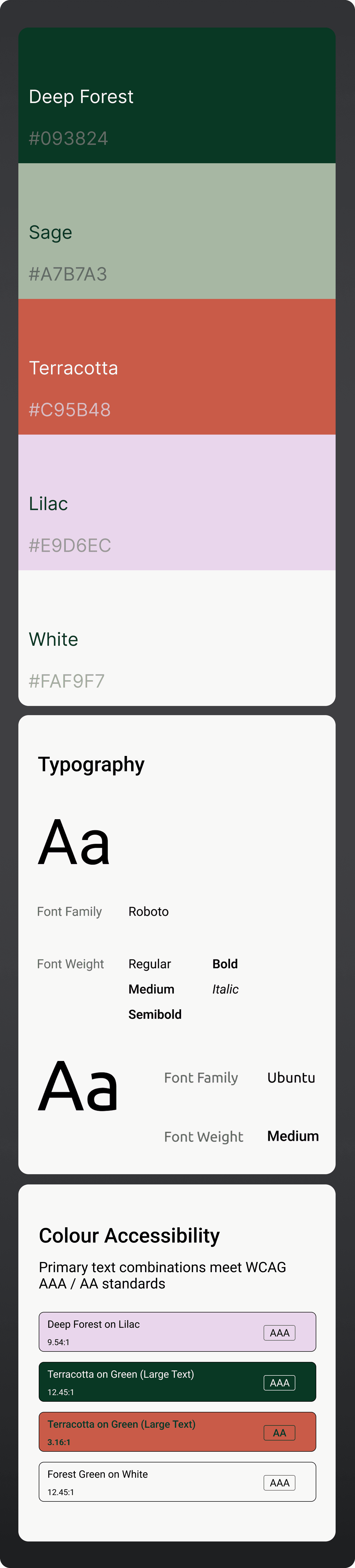
The redesign introduces a structured visual system, a considered colour palette of terracotta, forest green, and lavender replacing the inconsistent blues, pinks, and yellows of the original.
Clean typography hierarchy and a layout that leads with mission and builds toward impact. Every section was designed to answer one question at a time.




The outcome
A full homepage redesign concept delivered as desktop and mobile Figma files - ready for developer handoff. The redesign gives ROOP a visual presence that matches the credibility and warmth of their mission, presenting their remarkable impact in a way that builds trust with potential donors and supporters.



Key learnings
Design for the mission, not just the brief
For a not-for-profit, every design decision should reinforce trust and warmth. Aesthetic choices are never just aesthetic, they affect whether someone chooses to donate or walk away.Hierarchy is everything
On a long homepage with a lot of information, clear visual hierarchy is what stops users from feeling overwhelmed. Leading with the most important thing, the mission, makes everything else land better.Responsive design is a respect decision
Designing for mobile isn't an afterthought. For organisations working in communities where phone is the primary device, a poor mobile experience means a missed connection.
