
Reimagining Melbourne's public transport app around personalisation
A user-centred redesign of the PTV app, addressing navigation friction and information overload through research, iteration, and a new personalisation system.
The Problem
Information overload, no personalisation
The PTV app serves millions of Melbourne commuters daily, but research revealed a consistent pattern: the app presents everyone with the same information-heavy experience, regardless of what they actually need.
Navigation friction, unclear labels, and an overwhelming number of nested screens made it harder for users to quickly find the information they were looking for.
This created an opportunity to rethink how the app prioritises information around individual commuter needs.
The Audience
Who I'm designing for
I designed this for everyday Melbourne commuters — people who use public transport regularly and want to get from A to B without unnecessary friction.
From students checking tram times between classes to professionals planning their morning commute, the common thread was the same: users knew what they needed, but the app made it harder than it should have been to find it.
Key insights
Unclear navigation: There was no clear icon or path to settings.
Misleading labels: Incorrectly labelled buttons caused confusion and made actions less predictable.
Screens within screens: Important features were buried within multiple layers of navigation, making them harder to discover.
Limited personalisation: The experience did not adapt to the information individual commuters used most frequently.
These insights highlighted an opportunity to simplify navigation while giving users more control over the information presented to them.


The Solution
A widget-based homepage
Imagine being able to personalise your PTV home screen to display exactly what matters most to you
Rather than removing functionality, I explored how the existing information could be reorganised around individual commuter needs.
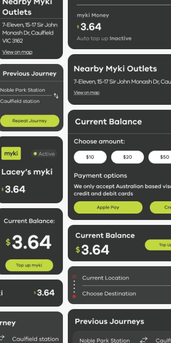
This led to a personalisation system for the PTV homepage, inspired by familiar iOS and Android home-screen experiences. Users can choose which information appears on their homepage, such as a preferred route, Myki balance, service alerts, or saved trips.
Instead of navigating through multiple screens, users can access the information that matters most to them as soon as they open the app.




The outcome
The final concept brings together a customisable homepage, a widget library covering key app features, and a redesigned navigation structure.
The interactive prototype demonstrates how commuters could personalise their experience around the information they use most frequently, while reducing navigation friction and cognitive load.
Key features include:
Customisable homepage widgets
Journey planner
Myki balance
Service alerts
Saved trips
Simplified navigation
More consistent UI patterns




Key learnings
Research grounds the design
User research stops you designing for yourself instead of your actual users.
Consistency builds trust
Standardising UI elements across the app made the experience feel more cohesive and intentional.
Personalisation doesn't have to be complex
Giving users control over what they see can dramatically reduce friction without redesigning everything.
